
Listening to colours
When Alfred Hitchcock decided to film Psycho in black and white, the British director asked his favourite composer, Bernard Hermann, to express the “black and white feeling” of music, in order to emphasize the suspense and the psychological emotions in the movie. Herrmann rose to the challenge and ended up composing one of the best soundtracks in the history of cinema.
It is well known that there is a psychology of colour and it influences our lives and feelings, but this will not be the topic of this blogpost.
For now, we want to understand the semantic relationship that links an object and its colour(s), in order to choose to best colour possible for that item.
As experts in packaging design, we are well aware that if we design a case for solar cosmetics without an exorbitant marketing and advertising budget, we are best off to consider integrating orange into the packaging. Otherwise, we could pay a huge price in lack of sales.
With this blogpost, we want to emphasize the importance of choosing the right colour for the right packaging, knowing the semantic relationship between colour and object.
Let’s go back to the beginning again. Hermann succeeded in giving Hitchcock the right “black and white soundtrack”, composed only with violins, cellos, violas and basses. He managed the nuances, the high and low notes with the same mastery Hitchcock put into the light and shadow of photography, creating iconic scenes we still remember clearly today.
It’s a curious coincidence that for the movie Schindler’s List, Spielberg chose to use the black and white shades too, and Williams composed an unforgettable soundtrack for this movie using a few violins.
The strong bond between music and colours has been developing alongside abstract art. It was one of the most important objects of study for Wasily Kandisky: for example, he understood the violet colour as a slow, lifeless tone.
The Russian painter believed that, in abstract art, a colour, once stripped of all recognizable form, should be “listened to” by the viewer and this process leads to feeling similar emotions he or she could perceive with music. In our minds, when we contemplate a vibrant red colour, we can feel the same emotions of listening to a certain musical rhythm.
We are all aware that we know more feelings than colours or musical notes. Actually, in the example of Hitchcock’s movie, it was the combination of pauses, the context, the mix of high-low-light-and-dark notes that evoked the feelings of fear and suspense in Hermann’s soundtrack, or pain and sadness in Williams’ composition for Schindler’s List.
Colours have an important role in our language and the way we retain information: there is a huge difference between a blue blood or a blue collar, you can see life in pink when you’re happy or see life in black and white when you have a simple view of what is right or wrong.
Inside a context, a sentence, or a shade, a colour communicates a feeling to us.
Synaesthesia is the ability to associate sounds and feelings with a certain colour.
Some people have this innate capacity and, when they see an object, they connect it with a particular colour or even a taste. This happens when there is a dual coding of information, and a synaesthete uses more than one sense at the same time to absorb and understand that information.
In packaging design, a whole colour coding has been built into packaging design, so colours can be communicatively effective when they are associated to the right context, considering these three variables:
- The designated meaning or experience
- The reference
- The trend
When we go to a supermarket, our brain associates the meaning implied in some colours related to food: pink/light, green/bio, black/gourmet. When we are in the drink aisle, we relate green to beer, red to coke, blue to isotonic drinks.
When we go to a big cosmetic store, we don’t need any signs to understand where products for men or women or are, we just to have a quick look at the store and we can orientate ourselves following the colour of the products on the shelves.
Then, when we go to the fragrances’ corner, we can almost guess the smell of one of the perfumes depending on whether its packaging is light or dark, pastel or golden shades etc.
When we drive a car, we know that the red colour warns us to be careful, or that the green light means we can proceed.
As we mentioned before, colours have different meanings according to the context, so when we say that our bank account is in the red, this refers to a quite a different experience than wearing a red dress.
Anyway, let’s get back to what interests us most here, which is the relationship between colours and packaging. The best thing a brand or a designer can do would be taking possession of one colour (like Coca Cola did), a colour that not only describes the brand itself but it becomes a necessary bench ar, for a product’s category.
In the world of luxury, there are products that have “borrowed” these colours:
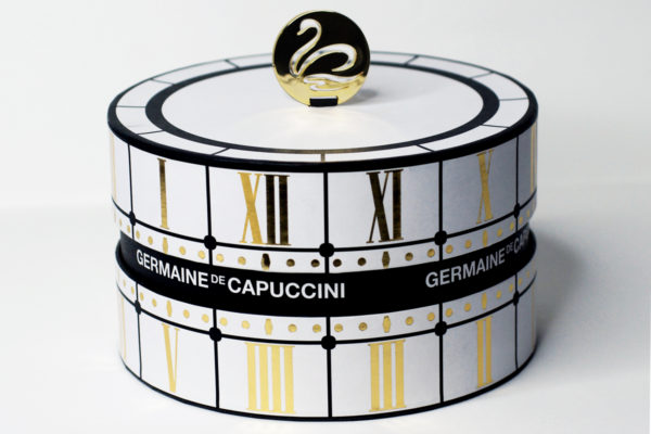
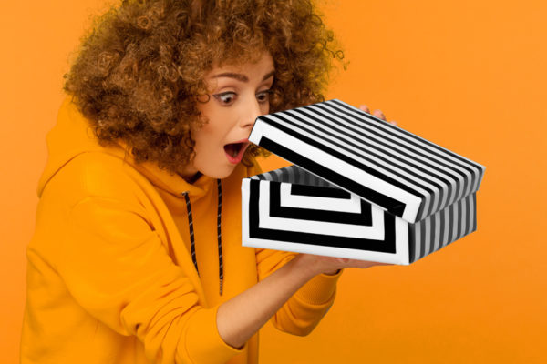
- Black and white
- Orange
- Turquoise
Did you guess the luxury labels behind these three colours?
If you didn’t, maybe you thought of another brand that uses the same code of colours. Any product with a good packaging and similar colours will be immediately included in the luxury world.
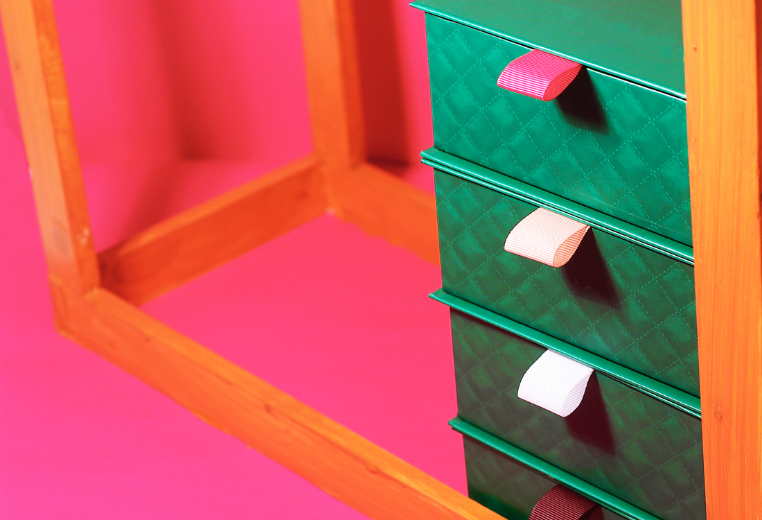
For example, for the Christmas campaign, I designed packaging for a client that sells cosmetic products. The original packaging was in black and white (the brand’s corporate colours), but the client wanted to break the rules, avoid the typical Christmas colours, andcause a dramatic effect. (I understand that).
Finally, he chose a powerful bright green.
The packaging was amazing, but it was not well received.
At Christmas, the traditional colours for cosmetic products are red, white, gold, and even black works, but it wasn’t the right moment to add green to the list.
Finally, during the last five years, luxury packaging – or niche products – traditionally designed using a chromatic range that runs from black shades to metallic or intense colours, are moving to white shades and pearl colours, suggesting minimalism versus opulence, experience versus belonging.
After all these examples and considerations, some questions arise:
- Are we living a dictatorship of colour?
- Has all this colour coding led to a democratization of tastes?
- As designers, do we choose colours almost mechanically because we understand these codes so well?
In the world of luxury and niche products, does this change to a more minimalistic aesthetic – simpler packaging, with less graphics and more neutral colours – possibly express the desire to move away from these conventions and make way for a less conditioned individual choice?
That’s the power of colour.
That’s why choosing the right one is so
Carmen Yago
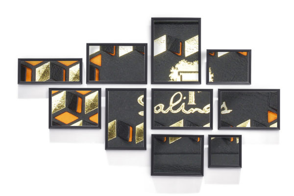
Creative & Strategist Marketing at Salinas Packaging Group
Antonio Romero Moll
This is indeed a really eyes opening post. Thank you!
MAKEBOX
Thank you Antonio, happy that you like it.